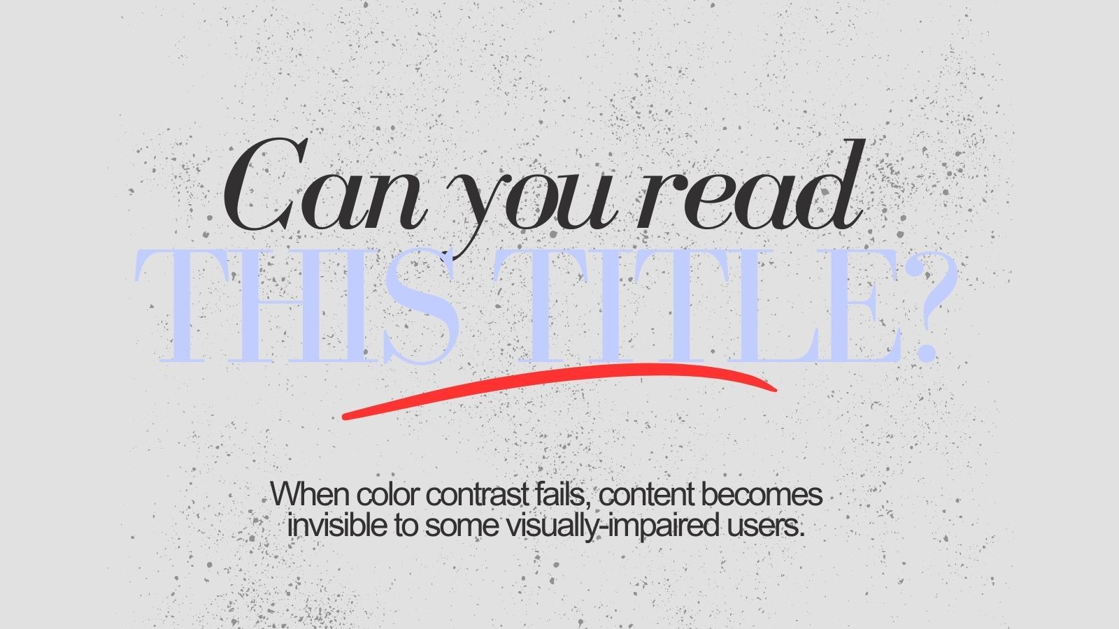
Can you read THIS TITLE? When color contrast fails, content becomes invisible to some visually-impaired users


I recently mentored the Fellows of Creative Climate Fellowship for their Creative Immersion. During one session, a Fellow asked me a simple but disarming question:"How do we make sure a website is accessible to people with disabilities?”
It made me pause. Not because I hadn’t heard of website accessibility guidelines, but because I realised how often I’d unconsciously designed for users who experience the web exactly the way I do: sighted, hearing, and comfortable with highly visual, interactive experiences.
Clients often asking to build websites that are visually rich and “alive”: scroll effects, parallax galore, hidden transitions, layered animations. And for many users, that’s great. Globally, around 39 million people are blind and 246 million live with moderate to severe vision loss. Even if only a portion of this population uses the internet, accessibility is not optional. Without it, entire websites simply don’t exist for them.
A website can look beautiful, pass a checklist, and STILL be difficult, or even impossible, for some users to navigate.
Guidelines like WACG and native accessibility features in platforms such as Webflow, WordPress, Figma and Canva are important. But the bigger shift for me is realising that accessibility isn’t just about compliance. It’s about equity.
Screen reader users don’t care how clever my website UX is if they can’t even get past the hero image because it lacks alt text (and 55.5% of images on the web still do, according to data by All Accessible).
That question reminded me that inclusive design starts earlier than we think, and requires questioning our defaults.
I’m still learning, but I’m designing more thoughtfully because of it. At the very least, every new website I build now includes an Accessibility Statement in the footer. It explains how visually impaired users can contact the site owner to request alternative formats for content that isn’t readable by screen readers. This is a practice already adopted by many credible news organisations and inclusivity-first institutions such as Greenpeace and Amnesty International.
If you’re working on websites, I’d love to hear what’s shaped your approach to accessibility. Or, if we’re being honest, are we still stuck in the mindset of “Our target audience are mostly sighted. Why go the extra mile?”
Actually, now that I’ve typed that question out, I feel ridiculous to even ask that.
Designing a website that dismisses visually impaired users is like planning a city without ramps for wheelchair users. It’s not neutral. It’s exclusion by default.